No-Fly??
Since its opening just over a week ago, students have been moving in to their Medici University Studio spaces in a steady stream. There has been a lot of excitement and many different compliments. Not too surprisingly, there has been one consistent complaint,
The whole region is “no-fly”? Are you crazy!?
University Guiding Principles
This seems like an opportune moment to talk about our University Guiding Principles. Four primary sources have been foundational in defining the Medici University Guiding Principles: for curriculum: Cathy Davidson & Chris Guillebeau; for campus design: Jane Jacobs & Penny Patton. I’ll talk about Davidson & Guillebeau’s dramatic impact on Medici University’s Curriculum Design next week. Today I’d like to explain how such perfectly nice people as Jane Jacobs and Penny Patton led Medici University Provost Isabella Medici to the crazy idea of creating a 6.5 hectare virtual university campus that is no-fly, no-skyboxes, and no-point-to-point teleport.
Jane Jacobs was an RL architecture critic. Penny Patton is a VR architecture critic. Their issues are different, but taken together, they form the core of our perspective on creating a campus, a community, a city. They form the core of our Medici University Guiding Principles:
- Jane Jacobs / The Death and Life of Great American Cities
- Penny Patton / The Digital Pasture
Vanessa’s Disclosure
I should quickly confess that while Jacobs & Patton are the core of the Medici University Guiding Principles, for me personally, Ernesto Ramirez & Sherry Pagoto also figure in prominently. I’m passionate about walking for the Jane Jacobs of it, but also for the Ramirez & Pagoto of it. For Jacobs, walking is key to the life of the city. For Ramirez & Pagoto, walking is key to the life of the individual. I’ve been blogging about both:
- Vanessa Blaylock / Walking
- Vanessa Blaylock / Medici University
Jane Jacobs
Jane Jacobs (1916 – 2006) was an American-Canadian journalist, author, and activist best known for her influence on urban studies. Her influential book The Death and Life of Great American Cities (1961) argued that urban renewal did not respect the needs of most city-dwellers. The book also introduced sociology concepts such as “eyes on the street” and “social capital”.
Jacobs was well known for organizing grassroots efforts to protect existing neighborhoods from “slum clearance” – and particularly for her opposition to Robert Moses in his plans to overhaul her neighborhood, Greenwich Village. She was instrumental in the eventual cancellation of the Lower Manhattan Expressway, which would have passed directly through SoHo and Little Italy, and was arrested in 1968 for inciting a crowd at a public hearing on the project. After moving to Canada in 1968, she joined the opposition to the Spadina Expressway and the associated network of expressways in Toronto planned and under construction.
As a mother and a female writer who criticized experts in the male-dominated field of urban planning, Jacobs endured scorn from established figures, who called her a “housewife” and a “crazy dame.” She did not have a college degree in urban planning, and was also criticized for being unscholarly and imprecise. She was accused of inattention to racial inequality, and her concept of “unslumming” has been compared with gentrification.
Jane Jacobs’ book The Death and Life of Great American Cities, is a deep and vast work. I recommend reading it. I hesitate to try to “summarize” such a rich work. But I will say that a couple of the key concepts that find their way into the MU campus design are Mixed Use and Pedestrian Access.
IRL suburbs spent a long time draining the life out of the city. Vast residential enclaves where you drive your car to gargantuan megamalls. Zoning doesn’t even allow a barber shop next to a home next to a small grocery store next to another home. Jacobs argued that it was precisely mixed use that provided for a vibrant, living, safe city.
You might only remember Who Framed Roger Rabbit as the film that gave us Jessica Rabbit’s curves, and the Roger Rabbit dance move. But it was also a film about how public transportation was destroyed in Los Angeles. It was a film about the creation of the capital city of car culture. In her book, and in her activism, Jane Jacobs often fought against expressways. No one can deny that expressways are a fast way to bypass the city and get somewhere else. But Jacobs argued that they were destructive to the city. They make great cities things to get to the other side of, instead of things to experience. They take away the immersive, pedestrian experience. They deplete the life of the street. They change streets from pedestrian scale, to car scale.
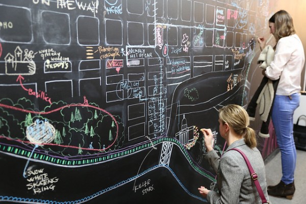
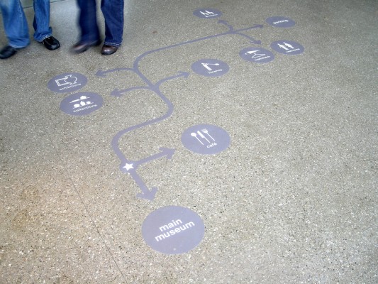
The problems that Jacobs saw with cars & expressways we see with flying & teleporting. Of course they’re faster ways to get somewhere else. But we passionately hope that Medici University is not about getting somewhere else. We’ve got about 40 artists currently working at MU, and we hope to have double that before we’re through. Being at MU should be as much about encountering others, seeing their work, and exchanging ideas with them, as it is about just digging in and doing your own work. Being at MU, we hope, is about walking and experiencing the life of the campus. About meeting your peers. About spontaneous collaboration. About creating the life of the campus. A campus not at flying & teleporting scale, but a campus at pedestrian scale.
Penny Patton
My minotaur avatar is over 7′ tall! Not exactly human sized. In RP sims where you’re playing a character, it just makes sense to make your avatar the size of the character you intend to be playing. Why claim to be a 6′ human or orc then make your avatar 8′ tall? A 12′ tall werewolf isn’t a werewolf, it’s a fuzzy giant.
— Penny Patton
In just 3 long, detailed, insightful blog posts, Penny Patton set the standard for understanding and improving life in the virtual city. In A Matter of Proportion, A Matter of Perspective, and A Matter of Scale, Patton established Avatar Height, Camera Height, and Building Height as key aspects of SL that are “wrong” by default and lead to poorer, less rich, less immersive experiences.
The virtual world that Philip Rosedale and his team gave us in 2003 was, and is, remarkable. They created, and enabled, so much. But early compromises, or omissions, like bad genetic code, still haunt us generations later. I can’t tease apart the chicken-and-the-egg of Too High Camera, Too Tall Avatar, and Too Large Building, but one does seem to feed the other.
Penny Patton’s Tips for a Better SL
Talk to people!
Say hi! Don’t be discouraged if they don’t reply! They’re likely busy or AFK, not ignoring you. If you’re IMing a stranger to say hi, try saying a bit more. Introduce yourself and let them know why you’re messaging them.Supersize
People tend to supersize everything in SL and this creates several problems. If you build everything larger, you need both more space and more land impact. This costs money. If your avatar is smaller and you build smaller, you can fit up to about four times as much content and detail into a given space. If human avatars are reduced to human sizes, fantasy avatars like minotaurs and werewolves can be reduced down to about 7-8′ tall and still look huge.Textures & Lag
A lot of people never consider the correlation between textures and lag. Fact of the matter is, videogames rarely use textures larger than 512×512, games like Crysis and Skyrim are often using 128×256 textures on surfaces. SL users leap straight to 1024×1024 to texture! SL only uses 512MB of VRAM for textures before your framerates start to crawl.SL Camera
Improving the camera would solve a lot of common SL issues, like low ceilings or small rooms causing camera conflicts. It’s also far more immersive as your in-world view is placed closer to your avatar’s eyes. This would also allow content creators to make better use of space and scale. The default camera leads to people building larger than they would otherwise need to just to compensate for this problem.
Default Camera Settings
In A Matter of Perspective Penny Patton shows us the power of Default Camera Settings and how to use the SL Debug Settings to change them to a much better experience. Coincidentally, just this week, the Firestorm team released a video showing some cool Keyboard & Mouse shortcuts for moving your default camera position around.
Penny Patton’s Vitruvian Shapes
Kool-aid of the Living VR City
Thank you for drinking the Kool-aid of the Living VR City with us. The Living VR University. We do appreciate that flying and point-to-point teleporting are faster. We hope Medici University can be an invitation to slow down. We hope MU can be experienced not at fly-in :: fly-out scale, but at pedestrian scale. As a place where a neighborhood means something. Give us a little time to fill out the campus – invite your friends to take studios too! And give the experience a little time to become more familiar to you. In the next half year there will be plenty of time to consider the virtues and critique the limitations of this vision.
Try taking the time to see what someone else is working on. Meetup with an old or new friend at Bacon Barista for coffee and conversation about why you’re in this world anyway. Or share a beer at the tables on the Covered Bridge across the Eleonora Gorge. As you look down on the rich aquatic life below in Eleonora Slough, perhaps you’ll come up with new ideas for collaborative projects. Brainstorm. Be open. Be silly. Think outside the box. Or better yet, shop for new boxes that better facilitate creativity and innovation.
Your Turn!
Okay. That’s the vision. What do you think? Are you with us? Or are we just crazy? Scroll down to the comments below and join the conversation. Thank you for being part of the experiment that is Medici University.
Images
Thank you to the following artists for enabling social production by choosing a Creative Commons license on Flickr:
- Brújula – compass by Vero Villa
- Edmonton Wayfinding Project by Mack Male
- Edmonton Wayfinding Project by Mack Male
- Across Air App by Jason McDermott
- Wayfinding by Heidi Blanton
- SMI Eye Tracking Glasses Wayfinding by SMI Eye Tracking
- Wayfinding in Herald Square by New York City Department of Transportation





Greetings, I’m submitting this so I can check the boxes for receiving notification of new posts by email! Thanks for all that you do.
Guidelines are really helpful in making all sorts of different decisions independently and as a group as we move forward with the MU vision. It has been so much fun so far, as has learning about Jane Jacobs. Right use of scale in SL is not an easy one. Maybe, as with Izzy’s proposal for community-oriented walk-throughs for purposes of appreciating / critiquing(?) new installs, we can have a topic-oriented one, where we’re looking at scale for those interested?
Thank you for all that You do!
Oh yes, I’m excited about the upcoming Perambulating with the Provost, (Walking Crit) sessions. And what a great idea to have one just on scale. Not as dogma handed down, but as a walking group to consider how things work and where they might work or contextualize even better.
Pingback: Short Application - Medici University
Pingback: Izzy’s Resources #1: 2015-02-09 | KATYPERRYOPOLIS!
Pingback: Going with the flow (and other metaphors) at MU/Creativity | MU/Creativity
Pingback: SITES | ----- MOBILIDADE URBANA ----------- ------------------------ TCC_CADU
Pingback: This Magic Moment - Medici University